GoodYou?
Packaging Design
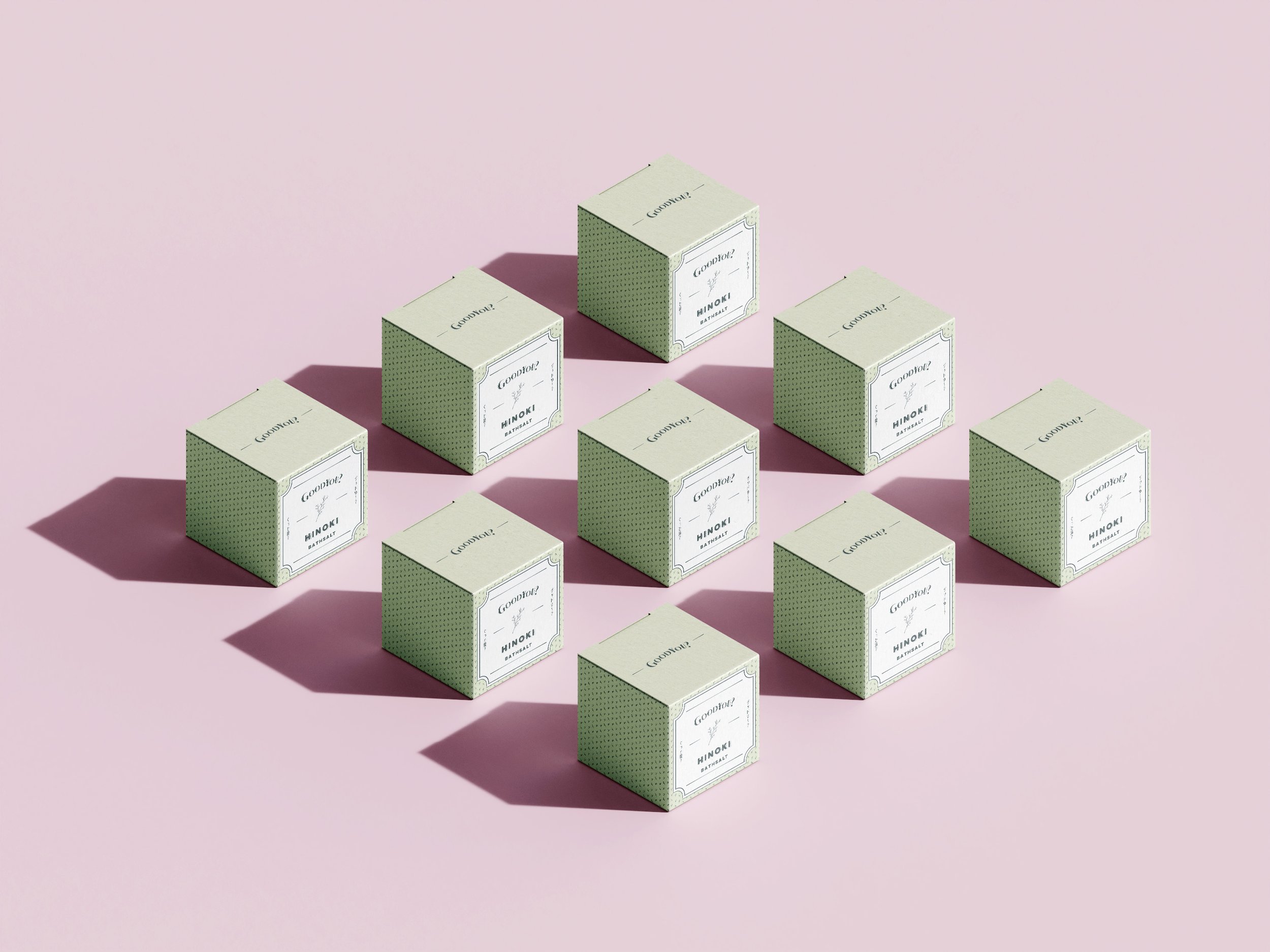
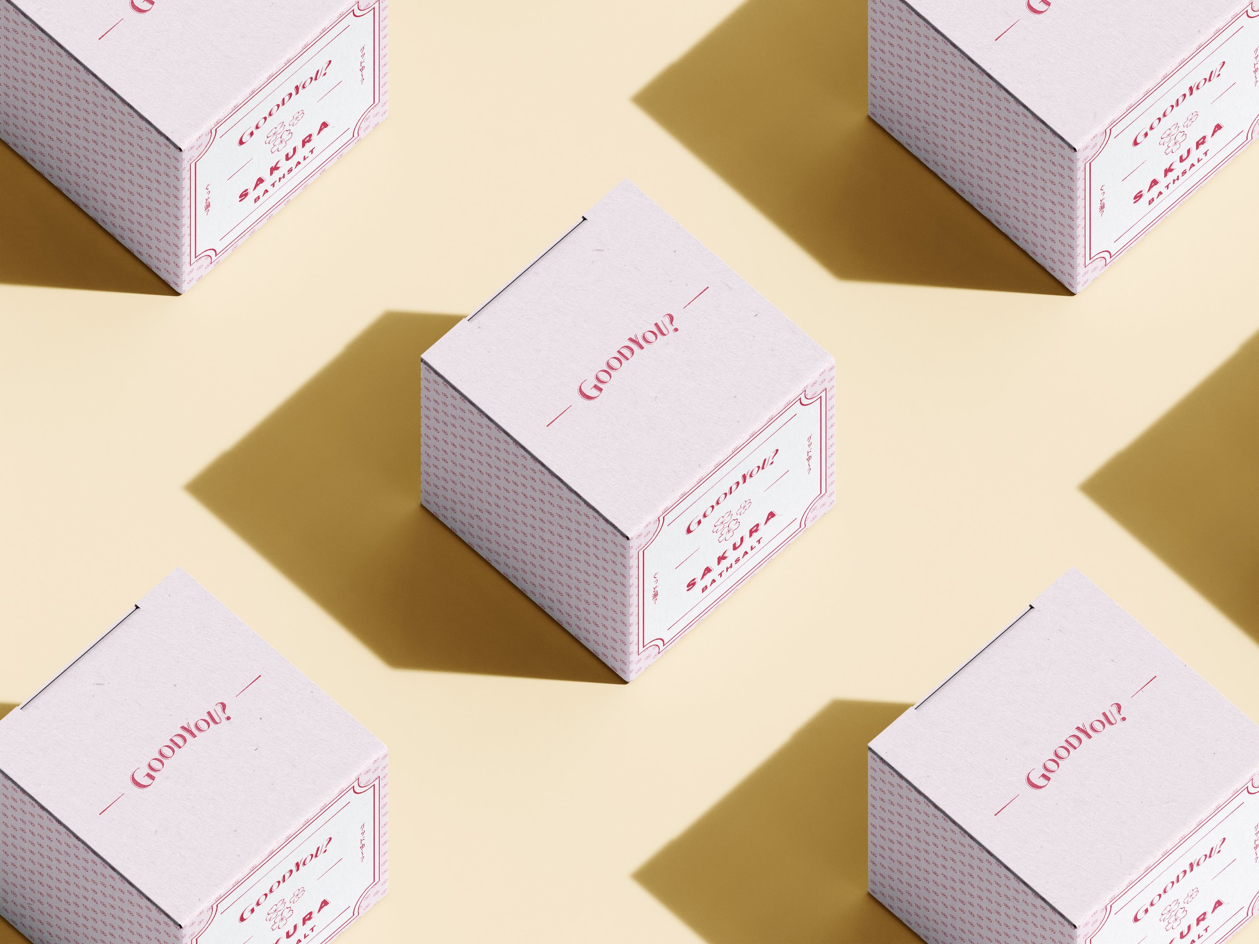
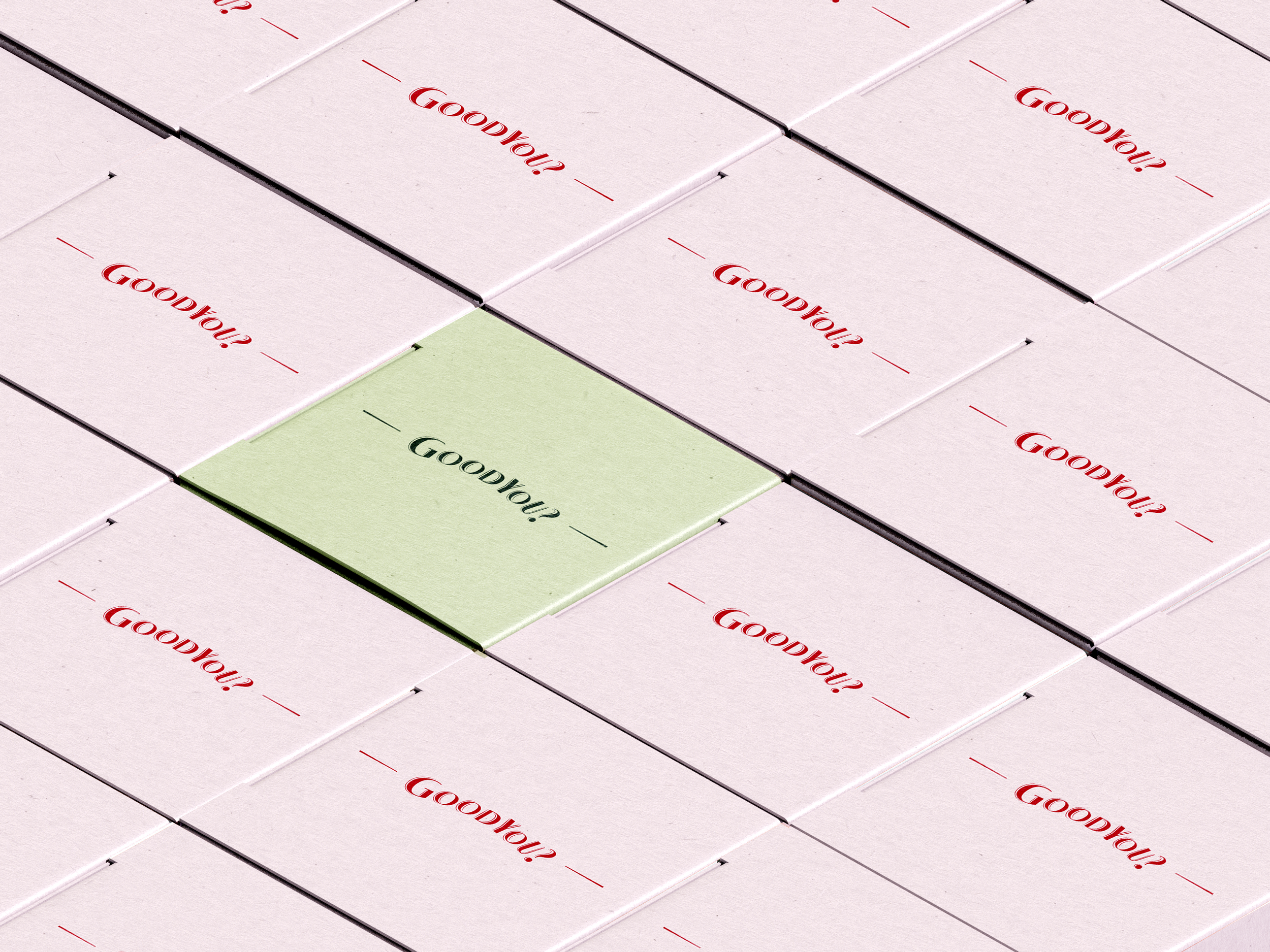
This project for GoodYou, a conceptual Japanese bath salt brand, focused on creating packaging that exudes classic elegance and tranquility. The brand name "GoodYou" plays on the dual meanings of "Good You?" and "Good Bath?" in Japanese. Pastel colors were chosen for their calming effect, while classic fonts and fine-lined illustrations convey simplicity and sophistication. The combination of these elements ensures a refined aesthetic that aligns with the themes of relaxation and self-care.
So, what's the issue?
The challenge with GoodYou, a conceptual Japanese bath salt brand, was creating its first edition of packaging that fully captured the brand’s essence of classic elegance and tranquility. The name "GoodYou" plays on the dual meanings of "Good You?" and "Good Bath?" in Japanese, and the packaging needed to reflect this duality while evoking feelings of relaxation and self-care. The design had to establish a calming, serene aesthetic that resonated with the target audience, ensuring an immediate connection with the brand’s wellness-focused message.
How can I solve the problem?
To address this, I developed packaging that exudes a sense of elegance and serenity, perfectly aligned with the GoodYou brand. By using pastel colors known for their calming effects, alongside classic fonts and fine-lined illustrations, I created a design that conveys simplicity and sophistication. This refined aesthetic not only communicates the brand’s focus on relaxation but also invites consumers to indulge in a self-care ritual. The new packaging design enhances the brand’s identity and appeals to customers seeking a tranquil bathing experience, ultimately fostering a deeper connection with the GoodYou brand.


