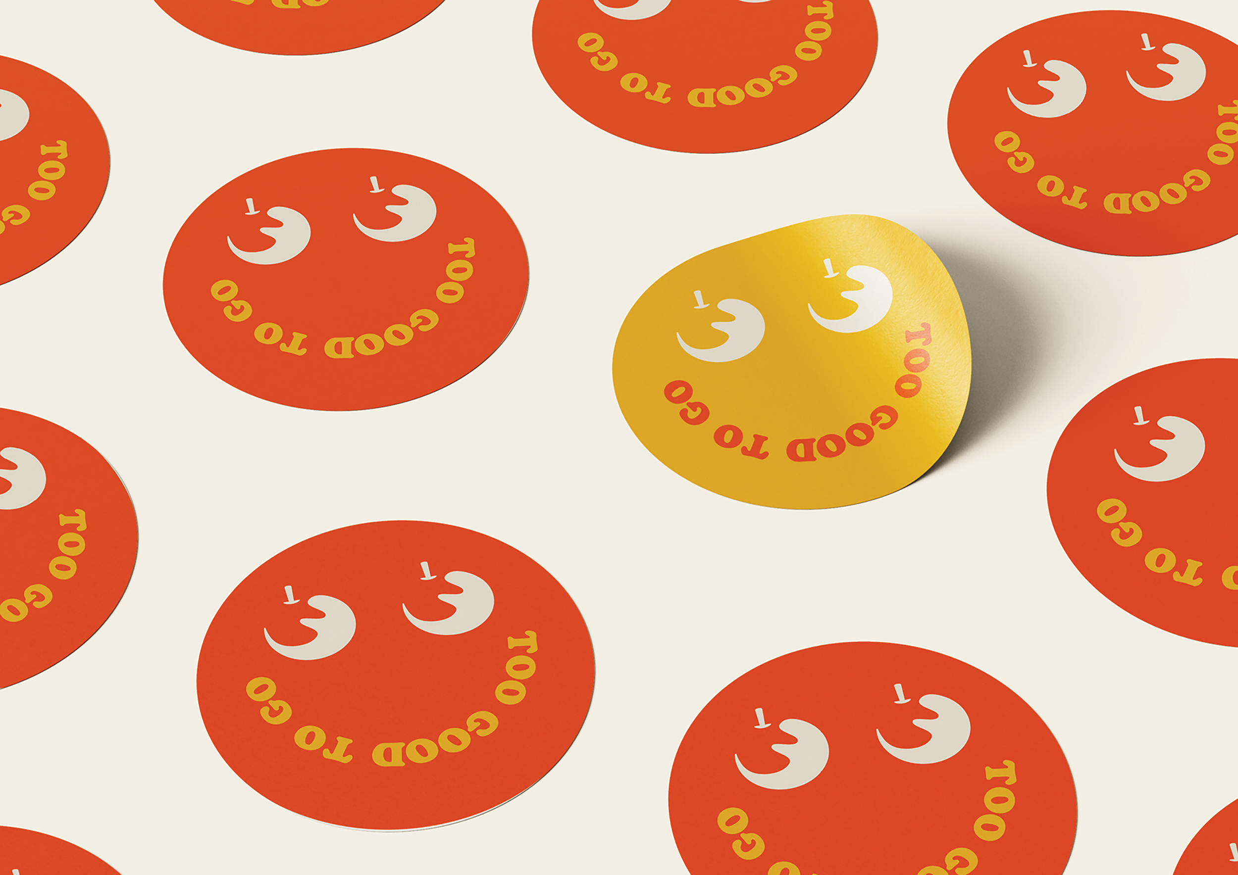
Too Good To Go
Branding Design
Too Good To Go is a mobile app that connects users with restaurants, cafes, bakeries, and grocery stores offering unsold surplus food at a discounted price. The goal is to reduce food waste by allowing consumers to purchase and pick up a "surprise bag" of food that would otherwise go to waste. The app promotes sustainability by helping businesses cut down on food waste while offering users affordable meals.
In this rebranding project for Too Good To Go, the goal was to visually communicate the company's commitment to freshness and collaboration. The new logo reflects these values while also introducing a playful and approachable tone, designed to resonate with the brand's mission of reducing food waste and fostering community engagement. The result is a refreshed identity that feels both vibrant and inviting.
So, what's the issue?
The challenge faced by Too Good To Go was that their visual identity lacked the vibrancy and approachability needed to fully reflect their mission of reducing food waste and encouraging community engagement. While the company is dedicated to freshness and collaboration, their branding didn’t effectively communicate these values to their audience. This gap made it harder for Too Good To Go to emotionally connect with consumers and convey the playful yet serious impact of their efforts.
How can I solve the problem?
To bring the brand to life, I created a new logo that’s friendly, playful, and full of color to better match Too Good To Go’s mission. This fresh look helps communicate their values of reducing food waste and fostering community in a way that feels approachable and vibrant. This refreshed identity not only emphasizes the importance of reducing food waste but also strengthens the sense of community. I created a stronger emotional connection with consumers, making Too Good To Go feel more relevant and approachable.


My first 50 initial sketches


